


Orbit Cards is a collection of modern Home Assistant dashboard cards with a shared visual style, shared editor controls, and support for custom icons, dynamic colours, popups, navigation, and compact grouped layouts.
Orbit Cards currently includes:
| Card | Type | Purpose |
|---|---|---|
| Room Card | custom:orbit-room-card |
A room overview card with a main entity, room navigation, status entities, side buttons, and curved quick actions. |
| Status Card | custom:orbit-status-card |
A status summary card with Standard, Icon Only, grouped Icon Only, and Person modes. |
| Action Card | custom:orbit-action-card |
A compact action card for scenes, scripts, automations, and grouped action shortcuts. |
- Built-in visual editors for all cards.
- Tabbed editor sections with grouped controls for room/card settings, status fields, buttons, curved buttons, and action buttons.
- Shared colour handling across cards.
- Named colours, theme colours, hex colours,
rgb(),hsl(), and light colour support where supported. - Colour preview swatches with a native colour picker and selectable theme colour previews.
- Material Design Icons and local SVG/image icons.
- Tap, hold, navigation, service, popup, and Browser Mod actions.
- Dynamic entity state updates scoped to only the entities used by each card.
- Grouped compact layouts for Status Icon Only and Action Card.
-
Open HACS.
-
Go to
Frontend. -
Open the menu and choose
Custom repositories. -
Add:
https://github.com/andyblac/Orbit-Cards -
Select category
Dashboard. -
Install
Orbit Cards. -
Refresh Home Assistant.
-
Add one of the Orbit cards from the dashboard card picker.
-
Download
dist/orbit-cards.jsfrom the repository. -
Copy it to:
/config/www/orbit-cards.js -
Optional: to use bundled
orbit:icons with a manual install, copydist/iconsto:/config/www/icons -
In Home Assistant, go to
Settings->Dashboards->Resources. -
Add this resource:
/local/orbit-cards.js -
Set the resource type to
JavaScript module. -
Refresh Home Assistant.
After updating the JavaScript file, refresh the browser or reload Home Assistant frontend resources. Some browsers and Home Assistant apps cache frontend resources aggressively, so a hard refresh may be needed after manual updates.
Colour fields support:
accent_color: theme
accent_color: blue
accent_color: amber
accent_color: "#82b1ff"
accent_color: rgb(130,177,255)
accent_color: hsl(216,100%,75%)
Home Assistant theme variables and color-* theme colour names are also supported. Short colour names such as red resolve to --color-red; full theme variable names such as primary-color resolve to --primary-color.
accent_color: primary-color
accent_color: accent-color
accent_color: state-light-active-color
accent_color: color-red
accent_color: google-yellow
In the visual editor, tap a colour preview swatch to open the colour selector. The selector opens on the Theme tab for named/theme colours and on the Picker tab for hex, rgb(), and hsl() colours. The Picker tab writes a hex colour and pre-populates from the current value when it can resolve it. The Theme tab shows selectable theme colour previews and writes the selected theme variable name.
Room Card also supports:
accent_color: lightWhen light is used with a light entity, the card uses the light's current colour when available.
Use Material Design Icons:
main_entity_icon: mdi:sofaUse local SVG or image files:
main_entity_icon: motion_detected.svg
main_entity_icon: /local/icons/motion_detected.svg
main_entity_icon: local:motion_detected.svg
main_entity_icon: orbit:shower_on.svg
Short filenames are resolved from /local/icons/.
Orbit Cards includes a small bundled icon set. These icons are installed with the card and appear in the editor's Files tab under Orbit Icons. Select one from the picker or reference it directly with the orbit: prefix:
main_entity_icon: orbit:fan.svg
main_entity_icon: orbit:motion_detected.svg
main_entity_icon: orbit:shower_on.svg
Bundled icons are resolved from the card's installed icons folder. With HACS this is served from /hacsfiles/Orbit-Cards/icons/. With a manual install, copy dist/icons beside the JavaScript file as described above.
In the visual editor, tap an icon preview to open the icon selector. The Icons tab uses the Home Assistant icon picker. The Files tab shows bundled Orbit icons and local files from /local/icons. Home Assistant does not always expose directory listings, so users can add a local manifest file:
/config/www/icons/manifest.json
[
  "motion_detected.svg",
  "motion_on.svg",
  "motion_off.svg"
]
The local manifest also supports richer entries:
[
  {
    "name": "My Custom Icon",
    "file": "my_custom_icon.svg",
    "tags": ["custom"]
  }
]
Inline SVG icons use the configured card/icon colour by default. For advanced multi-colour SVGs, set the matching icon override key to false to preserve the SVG's own colours:
main_entity_icon_svg_color_override: false
button1_icon_svg_color_override: false
curve_button1_icon_svg_color_override: falseSupported action types:
tap_action:
action: nonetap_action:
action: more-infotap_action:
action: toggletap_action:
action: navigate
navigation_path: /lovelace/securitytap_action:
action: call-service
service: scene.turn_on
service_data:
entity_id: scene.movie_timeOrbit Cards supports a shorthand popup action. Browser Mod must be installed for Browser Mod popups.
tap_action:
action: popup
popup_title: Security
popup_content:
type: vertical-stack
cards:
- type: tile
entity: alarm_control_panel.house_alarm
vertical: true
- type: tile
entity: cover.garage_roller_door
vertical: true
style: |
--popup-min-width: 400px;
--popup-max-width: 500px;
--popup-border-radius: 20px;Native Browser Mod fire-dom-event actions are also supported:
tap_action:
action: fire-dom-event
browser_mod:
service: browser_mod.popup
data:
title: Security
content:
type: tile
entity: alarm_control_panel.house_alarmBubble Card popups can be opened with a normal hash navigation action:
tap_action:
action: navigate
navigation_path: "#security"Place the matching Bubble Card popup on the same dashboard view:
type: custom:bubble-card
card_type: pop-up
hash: "#security"
name: Security
icon: mdi:shield-home
cards:
- type: tile
entity: alarm_control_panel.house_alarm
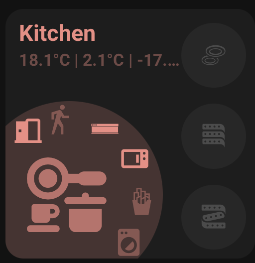
vertical: trueRoom Card is a room-focused dashboard card. It shows a large room icon, a room/card name, status text, optional side buttons, optional curved buttons, and a navigation action for the card body.
type: custom:orbit-room-card
room_name: Living Room
area: living_room
accent_color: blue
main_entity: light.living_room
navigate:
navigation_path: /lovelace/living-room
status1: sensor.living_room_temperature
status2: sensor.living_room_humidity
status_separator: "|"
button1: light.floor_lamptype: custom:orbit-room-card
room_name: Living Room
area: living_room
accent_color: theme
status_color: green
main_entity: light.living_room
main_entity_icon: mdi:sofa
main_entity_icon_on: mdi:lightbulb-on
main_entity_icon_off: mdi:lightbulb
main_entity_tap_action:
action: more-info
main_entity_hold_action:
action: none
navigate:
navigation_path: /lovelace/living-room
status1: sensor.living_room_temperature
status1_icon: mdi:thermometer
status1_decimal_places: 1
status2: sensor.living_room_humidity
status2_icon: mdi:water-percent
status2_decimal_places: 0
status3: binary_sensor.living_room_motion
status3_icon: mdi:motion-sensor
button1: light.floor_lamp
button1_icon: mdi:floor-lamp
button1_on_color: amber
button1_off_color: theme
button1_tap_action:
action: toggle
button2: fan.living_room
button2_icon: mdi:fan
button2_tap_action:
action: toggle
curve_buttons_lock_position: true
curve_button1: scene.movie_time
curve_button1_icon: mdi:movie-open
curve_button1_tap_action:
action: call-service
service: scene.turn_on
service_data:
entity_id: scene.movie_time
curve_button2: script.good_night
curve_button2_icon: mdi:weather-night
curve_button2_tap_action:
action: call-service
service: script.turn_on
service_data:
entity_id: script.good_night
action_button: script.room_shortcut
action_button_icon: mdi:dots-horizontal-circle| Option | Description |
|---|---|
room_name |
Overrides the displayed room/card name. Falls back to the selected area name, then entity name. |
area |
Home Assistant area used for automatic room name and icon fallback. |
accent_color |
Main room accent colour. Supports shared colour formats and light. |
status_color |
Colour used for the status text row. Falls back to accent_color. |
main_entity |
Main entity for the large room icon, main icon colour, and main entity actions. |
main_entity_icon |
Main entity icon override. Falls back to entity icon, area icon, or default room icon. |
main_entity_icon_on |
Main entity icon used when main_entity is ON or active. |
main_entity_icon_off |
Main entity icon used when main_entity is OFF or inactive. |
main_entity_icon_svg_color_override, main_entity_icon_on_svg_color_override, main_entity_icon_off_svg_color_override |
Advanced YAML-only SVG colour controls. Defaults to true, which forces the configured icon colour. Set the matching key to false to preserve the SVG's own colours. |
main_entity_tap_action |
Main entity/icon tap action. Defaults to more-info. |
main_entity_hold_action |
Main entity/icon hold action. Defaults to none. |
navigate.navigation_path |
Card body navigation path. Room Card body tap is navigation-only. |
status1, status2, status3 |
Optional status entities shown under the room/card name. |
status_separator |
Separator shown between status values. Defaults to |; spaces are added automatically in the rendered card. |
statusX_icon |
Optional prefix icon for status X. Supports MDI/custom icon packs, local SVG/image files, bundled orbit: icons, or pasted text/emoji such as 🌡️. |
statusX_decimal_places |
Optional decimal place override for numeric status X. Leave unset to use the entity's Home Assistant display precision. |
button1 to button4 |
Optional side button entities. |
buttonX_icon |
Icon override for side button X. |
buttonX_icon_on |
Icon override when side button X is ON or active. |
buttonX_icon_off |
Icon override when side button X is OFF or inactive. |
buttonX_icon_svg_color_override, buttonX_icon_on_svg_color_override, buttonX_icon_off_svg_color_override |
Advanced YAML-only SVG colour controls for side button icons. Defaults to true. Set the matching key to false to preserve the SVG's own colours. |
buttonX_on_color |
ON colour for side button X. Supports shared colour formats and light. |
buttonX_off_color |
OFF colour for side button X. |
buttonX_tap_action |
Tap action for side button X. Defaults to toggle. |
buttonX_hold_action |
Hold action for side button X. Defaults to more-info. |
buttonX_state_template |
Template used to decide whether side button X is active. |
curve_button1 to curve_button6 |
Optional curved button entities shown around the main icon. |
curve_buttonX_icon |
Icon override for curve button X. |
curve_buttonX_icon_on |
Icon override when curve button X is ON or active. |
curve_buttonX_icon_off |
Icon override when curve button X is OFF or inactive. |
curve_buttonX_icon_svg_color_override, curve_buttonX_icon_on_svg_color_override, curve_buttonX_icon_off_svg_color_override |
Advanced YAML-only SVG colour controls for curve button icons. Defaults to true. Set the matching key to false to preserve the SVG's own colours. |
curve_buttonX_tap_action |
Tap action for curve button X. Defaults to more-info. |
curve_buttonX_hold_action |
Hold action for curve button X. Defaults to none. |
curve_buttonX_state_template |
Template used to decide whether curve button X is active. |
curve_buttons_lock_position |
Locks curved button positions so they do not compress or reflow. |
action_button |
Optional standalone action button shown near the upper-right edge of the main circle. It uses curved-button style icon/state controls, but has no button background. |
action_button_icon, action_button_icon_on, action_button_icon_off |
Icon overrides for the standalone action button. |
action_button_icon_svg_color_override, action_button_icon_on_svg_color_override, action_button_icon_off_svg_color_override |
Advanced YAML-only SVG colour controls for the standalone action button. Defaults to true. |
action_button_on_color |
Optional ON icon colour override for the standalone action button. If unset, the card accent_color is used. |
action_button_off_color |
Optional OFF icon colour override for the standalone action button. If unset, the card accent_color is used. |
action_button_tap_action |
Tap action for the standalone action button. Defaults from the selected entity domain, for example scene.turn_on, script.turn_on, automation.trigger, button.press, input_button.press, toggle, or more-info for passive entities. |
action_button_hold_action |
Hold action for the standalone action button. Defaults to none. |
action_button_state_template |
Template used to decide whether the standalone action button is active. |
The Room Card editor includes quick entity filters for the Action Button picker: All, Automations, Buttons, Cameras, Scenes, and Scripts. All keeps the picker unrestricted.
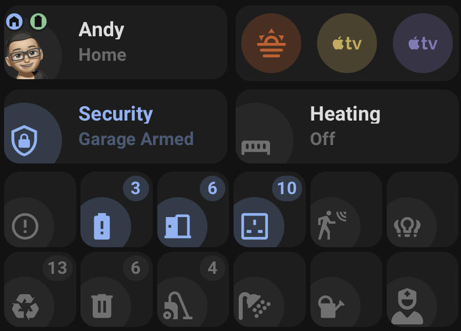
Status Card shows entity state in three modes:
standard: wide status card with name, icon, and status text.icon_only: compact square status card with icon and optional numeric badge.person: person card with profile picture, tracker status, zone badge, and battery badges.
type: custom:orbit-status-card
mode: standard
main_entity: sensor.heating_state
status_name: Heating
accent_on_color: red
accent_off_color: theme
tap_action:
action: navigate
navigation_path: /dashboard-heating/heating-control
main_entity_tap_action:
action: more-infoStandard mode uses:
status_namewhen set.- Otherwise the entity
friendly_name. label_templatewhen set for the displayed status.- Otherwise the entity
labelattribute when available. - Otherwise the formatted entity state.
- The entity
navigationattribute when no explicit navigation path is set. - Colour priority is
accent_on_color/accent_off_color, then the entitycolorattribute, then the theme fallback.
type: custom:orbit-status-card
mode: icon_only
main_entity: sensor.number_of_lights_on
accent_on_color: amber
accent_off_color: theme
tap_action:
action: more-infoIcon Only mode shows a square icon card. The badge is hidden when the displayed label is numeric 0.
Use entities to place multiple Icon Only items inside one Orbit Status Card.
type: custom:orbit-status-card
mode: icon_only
wrap: true
items_per_row: 3
separate_cards: false
entities:
  - entity: sensor.number_of_lights_on
    accent_on_color: amber
    main_entity_icon: mdi:lightbulb-group
    main_entity_tap_action:
      action: popup
      popup_title: Lights
      popup_content:
        type: tile
        entity: light.living_room

  - entity: sensor.number_of_doors_open
    accent_on_color: blue
    main_entity_icon: mdi:door-open

  - entity: sensor.unavailable_entities
    accent_on_color: red
    main_entity_icon: mdi:alert-circle-outline
Set separate_cards: true to add a small gap and make each grouped item read as its own card.
type: custom:orbit-status-card
mode: icon_only
wrap: true
items_per_row: 3
separate_cards: true
entities:
  - entity: sensor.recycle_collection
    accent_on_color: blue
    label_template: state_attr('sensor.recycle_collection', 'daysTo')
    state_template: state_attr('sensor.recycle_collection', 'daysTo') | int < 2
  - entity: sensor.rubbish_collection
    accent_on_color: green
    label_template: state_attr('sensor.rubbish_collection', 'daysTo')
state_template: state_attr('sensor.rubbish_collection', 'daysTo') | int < 2type: custom:orbit-status-card
mode: person
main_entity: person.andrew
tracker_entity: device_tracker.andrew_phone
eta_entity: sensor.andrew_eta
battery_entity_1: sensor.andrew_phone_battery
battery_entity_2: sensor.andrew_watch_battery
tap_action:
action: more-info
main_entity_tap_action:
action: nonePerson mode uses:
main_entityas the person entity.- The person entity picture as the main image.
- The entity icon as a fallback if no person picture is available.
tracker_entityfor the displayed location/status.eta_entityappended to the status when the tracker is nothome.- A zone badge based on the active Home Assistant zone.
- Up to two battery badges.
- Battery badge taps always open
more-infofor the battery entity.
state_template controls ON/OFF detection. label_template controls the displayed text or badge value.
type: custom:orbit-status-card
mode: icon_only
main_entity: sensor.recycle_collection
state_template: state_attr('sensor.recycle_collection', 'daysTo') | int < 2
label_template: state_attr('sensor.recycle_collection', 'daysTo')
accent_on_color: green
accent_off_color: theme
For Icon Only mode, numeric 0 is OFF and values greater than 0 are ON unless a state_template overrides the detection. Common normal/safe text states such as off, disarmed, closed, locked, clear, normal, home, online, and connected are treated as OFF.
| Option | Description |
|---|---|
mode |
standard, icon_only, or person. Defaults to standard. |
main_entity |
Required. Standard/Icon Only use it as the status entity. Person mode uses it as the person entity. |
entities |
Icon Only only. Optional list of grouped status items. Each item supports entity, colours, icons, templates, and actions. |
wrap |
Icon Only group only. Allows grouped items to wrap onto additional rows. |
items_per_row |
Icon Only group only. Number of items per row when wrap is enabled. Defaults to 3. |
separate_cards |
Icon Only group only. Adds a small gap between grouped items and gives each item its own rounded card background. |
status_name |
Standard mode only. Overrides the entity friendly_name. |
tracker_entity |
Person mode only. Tracker entity used for displayed location/status. |
eta_entity |
Person mode only. Optional ETA entity appended when the tracker is not home. |
battery_entity_1 |
Person mode only. First battery badge entity. |
battery_entity_2 |
Person mode only. Second battery badge entity. |
state_template |
Standard/Icon Only only. Template used for ON/OFF detection. |
label_template |
Standard/Icon Only only. Template used for displayed status text or badge value. |
accent_on_color |
ON colour override. If unset, the entity color attribute is used when available, then theme. |
accent_off_color |
OFF colour override. If unset, the entity color attribute is used when available, then theme. |
main_entity_icon |
Standard/Icon Only only. Main entity icon override. Falls back to entity icon. |
main_entity_icon_on |
Standard/Icon Only only. Icon used when the status is ON. |
main_entity_icon_off |
Standard/Icon Only only. Icon used when the status is OFF. |
main_entity_icon_svg_color_override, main_entity_icon_on_svg_color_override, main_entity_icon_off_svg_color_override |
Advanced YAML-only SVG colour controls. Defaults to true, which forces the configured icon colour. Set the matching key to false to preserve the SVG's own colours. |
tap_action |
Card tap action. Defaults to navigate in Standard mode and more-info in Icon Only/Person modes. |
main_entity_tap_action |
Main entity/icon tap action. Defaults to more-info in Standard mode. In Icon Only/Person modes it falls back to tap_action when unset or none. |
main_entity_hold_action |
Main entity/icon hold action. Defaults to none. |
Action Card is a compact square card for activating scenes, scripts, automations, buttons, input buttons, input booleans, and other action-like entities.
type: custom:orbit-action-card
main_entity: scene.movie_time
accent_color: blue
Default tap actions are selected from the entity domain:
| Domain | Default tap action |
|---|---|
scene |
scene.turn_on |
script |
script.turn_on |
automation |
automation.trigger |
button, input_button |
button.press |
input_boolean |
toggle |
| Other domains | toggle |
Hold action defaults to more-info.
type: custom:orbit-action-card
wrap: true
actions_per_row: 3
separate_cards: true
entities:
  - entity: scene.movie_time
    accent_color: blue
    main_entity_icon: mdi:movie-open
  - entity: script.good_night
    accent_color: purple
    main_entity_icon: mdi:weather-night
  - entity: automation.motion_lights
    accent_color: amber
    main_entity_icon: mdi:motion-sensor
Set separate_cards: true to add a small gap and make each grouped action read as its own card.
| Option | Description |
|---|---|
main_entity |
Required for a single Action Card. Entity to activate. |
entities |
Optional list of grouped action items. Each item supports entity, accent_color, main_entity_icon, main_entity_icon_svg_color_override, tap_action, and hold_action. |
wrap |
Grouped mode only. Allows actions to wrap onto additional rows. |
actions_per_row |
Grouped mode only. Number of actions per row when wrap is enabled. Defaults to 3. |
separate_cards |
Grouped mode only. Adds a small gap between grouped items and gives each item its own rounded card background. |
accent_color |
Base card/icon colour. Defaults to theme. |
main_entity_icon |
Optional icon override. Falls back to entity icon, then a domain icon. |
main_entity_icon_svg_color_override |
Advanced YAML-only SVG colour control. Defaults to true, which forces the configured icon colour. Set to false to preserve the SVG's own colours. |
tap_action |
Optional tap action override. Defaults by entity domain. |
hold_action |
Optional hold action override. Defaults to more-info. |
Each card includes a visual editor. The editor supports:
- Entity pickers.
- Area picker for Room Card.
- Mode selection for Status Card.
- Tabbed Room Card sections:
Card,Status,Buttons, andCurve Buttons. - Segmented selectors for Room Card status slots, side buttons, and curved buttons.
- Grouped item add, remove, and reorder controls.
- Wrap and separate-card layout controls for grouped cards.
- Action selectors.
- Icon fields.
- Colour fields with preview swatches and a colour picker.
- Card version display.
Most card configuration can be completed without writing YAML. YAML remains useful for larger grouped cards, complex popup content, and templates.
Orbit Cards includes built-in translation support for editor labels, picker text, and default fallback card names. The active Home Assistant language is detected from hass.locale.language; missing strings fall back to English.
Translations live in:
src/translations/
Add a new language file such as fr.json, then register it in src/common/localize.js.
Home Assistant 2026.6 and newer can suggest custom cards when a user chooses an entity from the card picker. Orbit Cards supports entity suggestions for all included cards.
Room Card is suggested for room-control style entities:
light, fan, climate, media_player, switch, cover, lock
Example generated config:
type: custom:orbit-room-card
main_entity: light.living_room
accent_color: light
area: living_room
The area value is included when Home Assistant exposes an area for the selected entity. Light entities use accent_color: light; other domains use theme.
Status Card is suggested for status-like entities. Person entities are suggested as Person mode:
type: custom:orbit-status-card
mode: person
main_entity: person.andrew
Numeric entities get both Standard and Icon Only suggestions:
type: custom:orbit-status-card
mode: standard
main_entity: sensor.number_of_lights_ontype: custom:orbit-status-card
mode: icon_only
main_entity: sensor.number_of_lights_onNon-numeric status entities get a Standard suggestion:
type: custom:orbit-status-card
mode: standard
main_entity: sensor.heating_state
Action-style domains such as scene, script, automation, button, and input_button are skipped by Status Card so the card picker stays tidy.
Action Card is suggested for action-style entities:
scene, script, automation, button, input_button, input_boolean
Example generated config:
type: custom:orbit-action-card
main_entity: scene.movie_timeThe cards provide layout hints to Home Assistant. In the dashboard editor these appear as Home Assistant grid sizes:
| Card/mode | Default layout |
|---|---|
| Room Card | 9 columns, minimum 6 columns |
| Status Card Standard | 9 columns, minimum 6 columns |
| Status Card Person | 9 columns, minimum 6 columns |
| Status Card Icon Only | Compact square layout |
| Action Card | Compact square layout |
Grouped Icon Only and grouped Action cards expand their column count based on the number of configured items and the wrap settings.
- Home Assistant Lovelace dashboards.
- Home Assistant 2025 and newer recommended.
- HACS or manual resource installation.
- Browser Mod is required only for Browser Mod popup actions.
- Bubble Card is required only for Bubble Card hash popups.
For bugs, feature requests, and releases, use the GitHub repository:
Created by AndyBlac.