React 19 Compatible - A modern, responsive admin dashboard template built with React 19, Bootstrap 5, and comprehensive component library.
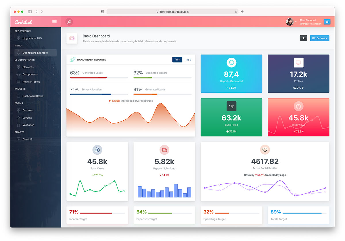
ArchitectUI React is a feature-rich, free admin dashboard template designed for modern web applications. Built with the latest React 19 and Bootstrap 5, it provides a solid foundation for creating professional admin panels, dashboards, and web applications.
This template offers clean, responsive design with a comprehensive set of UI components, charts, forms, and layout options. Perfect for startups, enterprises, and developers looking for a production-ready admin dashboard solution.
- React 19.2 - Latest React with improved performance and features
- Vite 8 - Lightning-fast build tool with instant HMR
- Vitest 4 - First-party test runner with React Testing Library
- Bootstrap 5.3.8 - Modern CSS framework with utilities
- Redux Toolkit - State management
- React Router v7 - Navigation and routing
- Sass/SCSS - Advanced styling capabilities
- 30+ Ready-to-use Components - Forms, tables, charts, modals, and more
- Multiple Dashboard Layouts - Analytics, CRM, Commerce, Sales, and Minimal
- Advanced Form Elements - Date pickers, file uploads, text editors, sliders
- Data Visualization - ApexCharts, Chart.js, Recharts integration
- Interactive Maps - Leaflet/OpenStreetMap and Vector Maps (no API key required)
- Responsive Design - Mobile-first approach with all device compatibility
- Flexible Sidebar - Collapsible with custom themes
- Header Variations - Multiple header styles and configurations
- Footer Components - Fixed and dynamic footer options
- Theme Customization - 9 pre-built color schemes
- Dark Mode Support - Professional dark theme option
- Node.js (LTS version) - Download here
- npm or yarn package manager
-
Clone or Download the repository
git clone https://github.com/DashboardPack/architectui-react-theme-free.git cd architectui-react-theme-free -
Install Dependencies
npm install --legacy-peer-deps
-
Start Development Server
npm start
The application will open in your browser at
http://localhost:3001
-
Create Production Build
npm run build
-
Preview Production Build
npm run preview
View the production build at
http://localhost:4173
architectui-react-theme-free/
├── .github/workflows/      # GitHub Actions CI workflow
├── public/                 # Static files
├── src/
│   ├── assets/             # SCSS entry, images, themes
│   ├── components/         # Reusable UI components
│   ├── config/             # Redux store configuration
│   ├── DemoPages/          # Demo pages and examples (lazy-loaded)
│   │   ├── Dashboards/     # Dashboard variations
│   │   ├── Components/     # UI component examples
│   │   ├── Forms/          # Form examples
│   │   └── Tables/         # Table examples
│   ├── Layout/             # Layout components
│   │   ├── AppHeader/      # Header components
│   │   ├── AppSidebar/     # Sidebar components
│   │   └── AppFooter/      # Footer components
│   ├── reducers/           # Redux slices (ThemeOptions)
│   └── utils/              # Small shared helpers
├── .env.example            # Documented VITE_* env vars
├── vite.config.js          # Vite configuration (env-driven)
├── vitest.config.js        # Vitest configuration
├── vitest.setup.js         # Shared test setup
├── eslint.config.js        # ESLint flat config
└── package.json            # Dependencies and scripts
| Command | Description |
|---|---|
npm start / npm run dev |
Start the Vite dev server (default port 3001) |
npm run build |
Create production build in build/ |
npm run build:analyze |
Build and open the Rollup bundle visualizer |
npm run preview |
Preview the production build locally (port 4173) |
npm run lint |
Run ESLint |
npm run lint:fix |
Run ESLint and auto-fix what it can |
npm run format |
Run Prettier in write mode |
npm run format:check |
Run Prettier in check-only mode |
npm test |
Run Vitest in watch mode |
npm test -- --run |
Run the test suite once (same mode CI uses) |
npm run test:ui |
Open the Vitest UI |
npm run test:coverage |
Run the suite once with v8 coverage reporting |
npm run test:e2e |
Run the Playwright route smoke test against the preview |
npm run test:e2e:install |
One-off: install the Chromium browser Playwright uses |
Copy .env.example to .env.local and adjust as needed. Only VITE_-prefixed keys are exposed to the browser bundle.
| Key | Default | Effect |
|---|---|---|
VITE_PORT |
3001 |
Dev server port |
VITE_BASE |
./ |
Public base path used by the production build (set to e.g. "/architectui/" when deploying to a subdirectory) |
Two layers of tests:
Unit / component (Vitest + React Testing Library) — tests live next to the code as *.test.jsx:
npm test              # watch mode
npm test -- --run     # single run
npm run test:coverage # v8 coverage report under coverage/
Shared setup (matchers, RTL cleanup, matchMedia / ResizeObserver / localStorage shims) is in vitest.setup.js; config is in vitest.config.js.
End-to-end (Playwright) — e2e/routes.spec.js spins up npm run preview and walks 24 demo routes, failing on any uncaught page error or "Element type is invalid" / "not a constructor" console error. First run needs the browser installed:
npm run test:e2e:install    # once
npm run test:e2e            # run the suite
Config in playwright.config.js.
- Top-level
<ErrorBoundary>(src/components/ErrorBoundary.jsx) catches any render-time crash in the demo pages and shows a friendly card with the error message, component stack (dev only), and a reload button instead of blanking the screen. - Theme preferences persist to
localStorage(src/config/persistThemeOptions.js). Color scheme, fixed-header / fixed-sidebar / fixed-footer toggles, background image, dark-mode choice, and the page-title options all survive refresh. A whitelist controls what gets written so non-persisted UI state stays in memory. - Dark mode via Bootstrap 5.3's
data-bs-theme. Auto (followsprefers-color-scheme), Light, or Dark — picked from the ThemeOptions side panel and persisted.src/hooks/useDarkModeSync.jskeeps<html>in sync and re-reacts to OS changes when the user leaves the pref on Auto. - Accessibility basics — skip-to-content link,
<header>/<nav>/<main>landmarks,:focus-visiblerings,aria-label/aria-expanded/aria-pressedon icon-only buttons, keyboard activation on the mobile overlay scrim.
See STARTER.md for the full "strip to starter" guide. Short version: rm -rf src/DemoPages/, swap three files, and you're left with just the shell + reliability features.
GitHub Actions runs on every push and pull request using the Node version pinned in .nvmrc. Pipeline:
npm ci --legacy-peer-depsnpm run lintnpx vitest runnpm run buildnpx playwright install --with-deps chromiumnpx playwright test --project=chromium(Playwright report uploaded as an artifact if any step fails)
ArchitectUI React supports all modern browsers:
- Chrome (latest)
- Firefox (latest)
- Safari (latest)
- Edge (latest)
- Opera (latest)
Customize the color scheme by modifying the Sass variables in:
src/assets/themes/[theme-name]/_variables.scss
Adjust layout settings in:
src/reducers/ThemeOptions.jsx
Follow the existing component structure in:
src/DemoPages/Components/
ArchitectUI is available in multiple frameworks:
| Framework | Repository | Status |
|---|---|---|
| React | Free Version | ✅ Active |
| Vue.js | Vue Version | ✅ Available |
| Angular | Angular Version | ✅ Available |
| HTML/jQuery | HTML Version | ✅ Available |
Upgrade to ArchitectUI React PRO for additional features:
- 200+ Premium Components - Extensive widget and component library
- 9+ Dashboard Layouts - Analytics, CRM, Commerce, Sales, and more
- 300+ Color Combinations - Unlimited customization options
- Premium Chart Libraries - Advanced data visualization
- Extended Form Elements - Rich form controls and validation
- Professional Support - Priority email support
- Regular Updates - Continuous improvements and new features
- Commercial License - Use in unlimited projects
Pricing: Starting at $69 (Personal), $149 (Developer), or $349 (Lifetime)
Get PRO Version | View PRO Demo
DashboardPack.com offers professional admin dashboard templates in multiple frameworks:
ArchitectUI Family:
- ArchitectUI React PRO - React 19 + Bootstrap 5
- ArchitectUI Vue PRO - Vue.js + Bootstrap 5
- ArchitectUI Angular PRO - Angular + Bootstrap 5
- ArchitectUI HTML PRO - HTML/jQuery + Bootstrap 5
Other Premium Templates:
- Finance SaaS Dashboard
- Marketing Dashboard
- Sales Dashboard
- TailPanel (TailwindCSS)
Colorlib.com provides free web templates and helpful articles:
Recommended Articles:
- 15 Best React Admin Dashboard Templates - Comprehensive guide to React dashboards
- 42 Free Bootstrap Admin Dashboard Templates - Bootstrap admin template roundup
Free Template Categories:
- Admin dashboards
- Landing pages
- Portfolio templates
- Blog themes
- UI Framework: Bootstrap 5.3.8, Reactstrap 9.2.3
- Charts: ApexCharts 5.10, Chart.js 4.5, Recharts 3.8
- Icons: FontAwesome 7.2, React Icons 5.6
- Forms: React Select, React Datepicker, React Input Mask
- Animations: Framer Motion 12.38, React Animations
- State Management: Redux Toolkit 2.11, React Redux 9.2
- Build Tools: Vite 8, Sass 1.99
- Quality: ESLint 9 (flat config), Prettier 3, Vitest 4 + React Testing Library 16
- Lightning-Fast HMR - Instant hot module replacement with Vite
- Code Splitting - Automatic route-based code splitting
- Tree Shaking - Eliminate unused code
- Optimized Builds - Minified and compressed assets
- Lazy Loading - Components load on demand
We welcome contributions. Read CONTRIBUTING.md for the full developer workflow (scripts, env vars, testing, commit style, PR checklist). Short version:
- Fork the repository
- Create a feature branch (
git checkout -b feature/amazing-feature) - Make sure
npm run lint,npm test -- --run, andnpm run buildall pass locally — same checks CI runs - Commit your changes (
git commit -m 'Add amazing feature') - Push to the branch (
git push origin feature/amazing-feature) and open a Pull Request
This project is licensed under the MIT License - see the LICENSE file for details.
MIT License

Copyright (c) 2023 DashboardPack

Permission is hereby granted, free of charge, to any person obtaining a copy
of this software and associated documentation files (the "Software"), to deal
in the Software without restriction, including without limitation the rights
to use, copy, modify, merge, publish, distribute, sublicense, and/or sell
copies of the Software...
- Documentation: Comprehensive guides and examples included
- GitHub Issues: Report bugs and request features
- Community: Join our developer community
- GitHub: Star the repository for updates
- DashboardPack: Follow for new template releases
- Changelog: Check CHANGELOG.md for version history
Developed by: DashboardPack.com
Design: Professional UI/UX team
Maintained by: Open source community
Made with care for the developer community